SPACE. THE FINAL FRONTIER

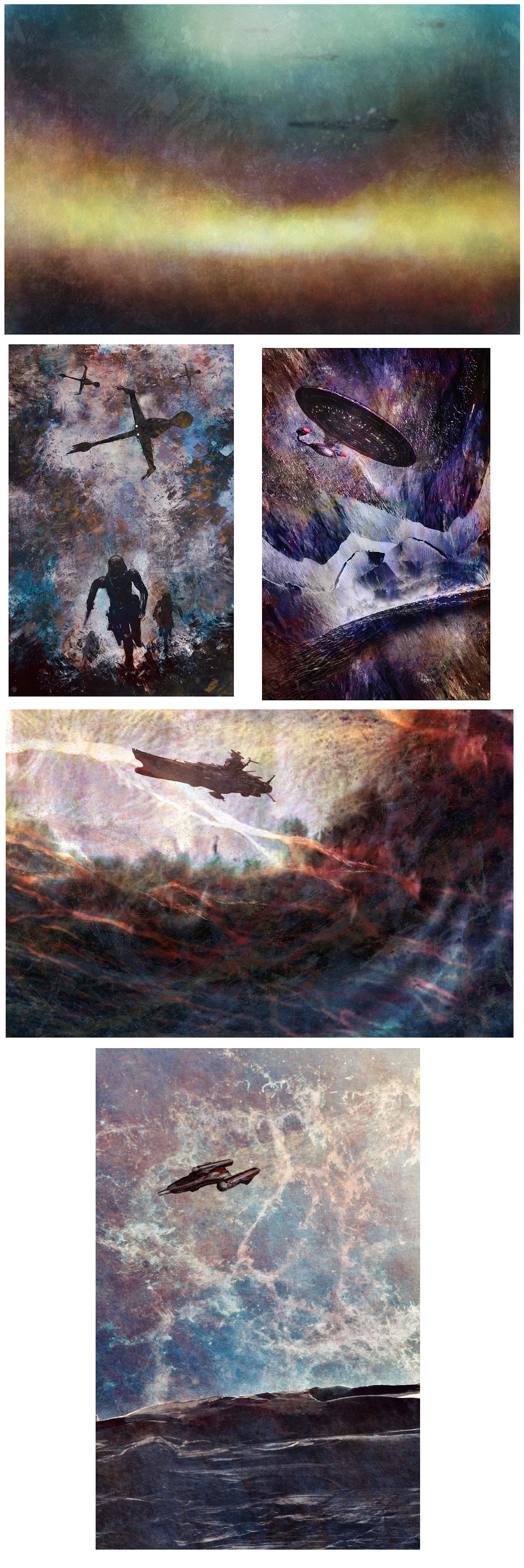
As I have been going through my recent work, I have often found myself inspired by science fiction, both as a fan and as an artist. I have been pondering over the years, what my favorite science fiction spaceships were growing up. As I gave it some thought, I realized that my favorites were not what I thought they would be. Below are my top five favorite spaceships in no particular order.

1. Imperial Star Destroyer (Star Wars) - Sleek, deadly, and imposing. I always get chills every time I see it, accompanied by the imperial theme song.

2. B-Wing Bomber (Star Wars) - It is odd yet interesting. It may not be as pretty or imposing as the other starships from the series, but I always cheer for it every time I see it in the movies.

3. Starship Enterprise (Star Trek Next Generation) - Elegant and advanced. This is my absolute favorite from the Star Trek series.

4. Starship Yamato aka The Argo (Star Blazers) - A World War II Japanese battleship transformed into a spacecraft is nothing short of awesome. It's like the little engine that could kick your ass everywhere.

5. Y-Wing Fighter (Star Wars) - Elegant, dangerous, and multi-functional. If I had the choice of flying any starship, this would be my top pick.

THUNDER ROAD: AN AMERICAN HORROR STORY

I recently collaborated with Midjpurney A.I. to create a series of photographs inspired by Bruce Springsteen's "Thunder Road". This is a common exercise among myself and many others, where we input song lyrics as prompts and allow the A.I. to generate its own interpretation through images. It's a fun and interesting way to explore the creative process, and in this case, the results were both haunting and stunning. As someone who grew up listening to "Thunder Road", I always viewed it as a hopeful song about young love and Americana. However, after this exercise, I now see it as a tale of horror in the American landscape. Although I had initially planned to do the entire ballad, I felt that the first verse was enough to convey the direction of the project. I'm excited to try this exercise with other iconic songs.

YET AGAIN

I'm thrilled to announce that I've once again, been chosen as a semi-finalist for the quarterly Illustrators Of The Future competition! Even though I'm only a semi-finalist, it still feels great every time. It's an incredible privilege to be among so many talented artists. Here are the pieces that the judges selected. I will speak to them. After all, they are winners.

DREAM SENTRY - Fantasy illustration of a “sentry”, maintaining the boundaries of the dream world and not allowing any entities to escape. Dynamic, clean yet dramatic.

GODDESS REBORN: Based on a watercolor sketch of a self-created character X-Mas Carol. This was a merge of that image in a digital format with a painted gothic background. Gothic, powerful, and somber. 

ARCHER HUNTING DEMONS - exactly how it sounds. A digital paint study that turned out quite well and surprisingly tight. I was ok about submitting this.

The next entries to the competition are A.I. assisted. Let us see how they do.

MAY THE FOURTH BE WITH ME!!!

No not Star Wars, but announcing that I am a semi-finalist again for Illustrators of the Future quarterly competition  (see past blogs for details).… ssiiigghhh.. again… I was going to stop announcing semi finalist wins until I became a first place winner. However, recently, I gave advise to someone that they should always tout their accomplishments. If you do not, then one else will. I don’t want to be a hypocrite now do I?…lol

So here are the selected finalists.

ZOMBIE KING OF THE NORTH - This was done while I was in Toronto over the Halloween weekend. We (wife and I) went to a haunted mansion and man did they do it right. Fantastic effects, performances that were over the top and scary AF.  I took many pictures including of a zombie person with sick a creepy make up.. Later that evening, back at our hotel room, I couldn’t sleep so I stayed up and reworked that photo as a digital painting. Cold, Creepy, strong and yet regal.

THE CRESCENT KNIGHT AND HIS MOON GIANTS - To be honest, when I started this piece, It was meant to be a Knight running away from a pursuing Giant. However, it didn’t feel that way. It felt like the Knight was in a brave charge towards the viewer. Why not be brave? He has a freakin Giant behind him. Then I thought, he should have an army of Giants behind him. The piece is dramatic, bold and beautifully textured.

FAIRY GUARDIANS OF THE NIGHT - This painting was inspired by the children who live in my building. So, as many Jersey Shore residents (and others) know, there has been a Red Lantern Fly infestation. Though they are pretty, they multiply in massive numbers and jump on you. Worst of all, they are severely damaging to the trees. The infestation is so bad that the state of NJ has made it a charge for residents to kill as many of them as they can. Personally, I could barely kill any. They are so fast and aloof. That said, while spending wonderful pool days with a sick NYC view (yes, I am bragging), watching the children in my building running around killing these awful insects inspired me to make a piece about little pixies/fairies protecting a beautiful realm. Excellent colors, simple yet striking.

I decided winning never gets boring.

TAROT

So I ended up doing a series of pieces based off the Major Arcana of Tarot. I thought about doing the whole deck, but I felt what I did made sense as a contained series. I find Tarot fascinating and meditative. These are the my more favorite pieces.

SAY THE WORD!

Billy Batson, a young boy pure of heart, was granted the ability to transform into SHAZAM, the world’s mightiest mortal. He would also go by the name Captain Marvel, but I think DC Comics is phasing that out. Regardless, me as a young child, this character was always relatable and fun. He would be the 1st Superhero toy that was ever bought for me by my mom. Both in comics, in cartoons and live action TV show, this character transcended. This weekend will be the second movie out for the Superhero. SHAZAM: FURY OF THE GODS. I enjoyed the first one a lot.  Here is to hoping the second is just as good. Below are some pieces I did in recent years. 

I GET SO EMOTIONAL BABY!

I have been working with Midjourney A.I. technology and I am torn. So many emotions are running through me. Ranging from excitement, to bewilderment, to anger, to fear, all of these feelings are equally justified. That said, as a digital artist, one does not want to be left in the dust. That has happened to me before and it’s not fun. So here is to a wonderful journey. I will be open, I will be ethical (as much as one can be), and I will have fun. Let us see where it takes us.

Attached is a pic in where I used the “imagine” prompt requesting imagery of Batman swinging dramatically across the night sky. This is what it gave me. As adorbale as it is, this tech has a way to go.

THREE TIMES A WINNER!

Happy New Year. My apologies for not blogging for a while. Getting caught up with the holidays and random projects side tracked me.

Well… I am a semi finalist… again, for The Illustrators of The Future (sponsored by the L RON HUBBARD FOUNDATION) I placed as a semi-finalist. Nice little hat trick!

Kudos and recognition from the industry leaders is always an awesome thing. It never gets boring!

Here are the select pieces that were chosen.

1. DRAGON HUNTERS AT REST - done using procreate, this piece is a play of ironic visualization. As the hunters are at rest, the prey flies around freely plotting their demise. Every time, I present this image to someone, they always smile. Something about this seems to generates that emotion.

2. DREAM COUNTRY - A Sandman-esque type of being with a more shamanic feel wondering the Dream World in where it resides. Haunting and somber.

3. ORPHEUS MARCHES IN HADES - after watching HADESTOWN on broadway, I wanted to do a piece that symbolized the hero’s march through the land of the undead. Referencing the statue located in Bulgaria, I composed this image. Haunting, dark, with loads of tension. I was delighted that this was chosen.

I will keep entering projects until I win!

WAR KARDS

Or “KARDS”, a World war 2 themed online (and physical) card game that is based in the United Kingdom. I was invited to put forward imagery (as per the project syllabus) of World War 2 Japanese Infantry soldiers for possible use. This assignment was in my wheelhouse and was more than happy to participate. Here are my favorite pieces from my submissions.

WOMAN IS KING

A while back I submitted some promotional artwork for The Woman King movie starring Viola Davis. This was a growth assignment for me. Focusing on African Art and culture was a bit of a change of pace for me, a welcomed change for that matter. That said, I did great. Was very proud with what I did and how I pushed myself as I came up with more concepts. The select pieces were my favorite among my submissions.

GOTHAM KNIGHTS

I was asked to propose promotional art materials for the upcoming video game “Gotham Knights”. As I started this assignment, I sort of cheated. I have composed so many DC fan art imagery in recent years, I decided for most of my submissions, I would just readjust past illustrations to make them work within the client specifications. Guess what. They were successful! Was very happy with the results and in some cases, improved upon them. Once in context they make more sense. Below are my favorite submissions. Particularly, the one of Talon (bottom left). I was experimenting with new digital brushes and did that on the fly. Though they were not selected, this was still a growth experience for me.

THE ANTI-HERO

Recently, I submitted a series of promotional art for the upcoming Black Adam movie starring Dwayne The Rock Johnson. I was super excited about doing this. I love Shazam (will blog about that character for another time) but I also love his arch nemesis Black Adam. He is the perfect Anti-hero. Not really a hero but not really a villain. Makes for complex and exciting stories. 

What I really am happy about is that Dwayne Johnson is starring as this character. To that I say… FINALLY!! As early as the THE MUMMY II, when, Dwayne Johnson starred as The Scorpion King, the comic book community (who also love professional wrestling) were screaming that he would make the perfect Black Adam. Fortunately, someone got a clue and actually listened. In addition, the inclusion of the JSA members Dr Fate and Hawkman got me really excited. They are great characters that deserve a lot more light. DC and Warner Bros need to be bold in the regard.

As to these pieces, these were my favorite among my submissions. This assignment was in my wheelhouse and am elated with the results. One of them was already featured on Talenthouse Magazine and picked up on several fan zines. Getting excited!

WHOOPS I DID IT AGAIN!

AGAIN!!! Illustrators of the Future which a quarterly Illustration competition sponsored by the L. Ron Hubbard foundation just announced me as a semi finalist for their third period. As exciting as it is to be acknowledged for a second time, this is even sweeter for some of the illustrations chosen are very personal to me. 

Here are the selected pieces. I will speak to them cause after all, they are winners…lol

(RIGHT TO LEFT)

RISE ME UP - A digital illustration of the late Jack Terricloth. The lead singer of the World Inferno Friendship Society who left us way to soon. This was a piece I did for the anniversary of his passing. Irony? I combined it with another image I composed of a The Great Pumpkin. Again, the beauty of Digital Art. Being able to revisit something and making it into something else. This made me happy.

DARK SEAMSTRESS OF JOY - Like my piece LEGERDEMAIN, what was meant to be a typographic exercise tasked by the most amazing Creative Director that I have ever worked under, has become a successful digital painting. This also was 12 years in the making. What I love is my muse for this design. She is an amazingly talented and close friend of me and my wife. I look forward to telling her the news.

RISE AGAINST THE SHADOW GIANTS - A fantasy painting which details a race of Shadow Giants who are determined to conquer everything in their path. To me, this felt like one of the strongest concept pieces that I have executed. The drama, composition and tone absolutely comes through. Not to be smug, but I was not at all surprised that this was chosen. 

I will continue to enter more work. Lets see if I can pull off a hat trick!..lol

DEATH BECOMES HER

With the new Sandman Netflix series out, which I am enjoying thus far, I am taken back with the excellent casting of Kirby Howell Baptiste as Death. She is killing it and I couldn’t be happier. She captures the tone, tenor and eccentricity of what the character is.

Though it took me years to get into Sandman Comics (as stated in previous blog posts), I was always a big fan of Death since day one. Interesting, wondrous, enchanting yet macabre. She lends herself to so much creative interpretations that range from dramatic to quirky, to tragic, to downright comical. It all works.

Below are the my favorite pieces that I composed of the character. Looking to add Kirby Howell version in the near future.

MOST EXCELLENT!

In mid 2020, I was tasked to submit promotional artwork for the Bill and Ted Face The Music movie. I am sharing this now because I just finally got around to watching the darn thing and it was actually endearing. It reminded me about how much I enjoyed the first movie (Bill and Teds Excellent Adventure) and the late 80’s metal scene of that era. So much talent, so much energy. Nothin but a good time! (See what I did there?..lol)

Below are my favorite pieces. For the average rock fan of that era, one can see I was influenced by Metalica and Ozzy Osbourne thrown in with Russian Constructivism. I loved how these came out.

Until next time, Be excellent to reach other. 

ETERNAL TRANSLATION OF THE LOST SUNSHINE or something like that!

Focus Features announced that needed digital artwork to help promote the 20 year anniversaries of the movies Lost In Translation and The Eternal Sunshine of The Spotless Mind (which is unbelievable because I am only 34). I jumped on this assignment right away. Yes, there were challenges with the restrictions and yes, they seemed to be strongly favoring very safe design directions. That said, I did not care. I went all in and was very happy with the outcome.

Here are my 4 favorites from my submissions (left to right) 

LOST IN TRANSLATION

• One is based off a fusion of Russian and Japanese Constructivism. Capturing the beautiful moment in where they hug at the end. Bold yet emotional.

• One is a play on graphic representative of the movie while playing with the multitude of colors from the streetlights of Tokyo. Whimsical and fun.

ETRERNAL SUNSHINE

• One is based off the wonder and magic of exploring winter in NYC. Haunting and somber.

• One is a tribute to the cinematic love stories of NYC. Strong, classical yet edgy.

I had so much fun doing these. I loved both movies and anything Bill Murray is a win in my book!

I’M AN ILLUSTRATOR FROM THE FUTURE

Correction, Illustrators of the Future which a quarterly Illustration competition sponsored by the L. Ron Hubbard foundation. Through workshops and competitions which are judged by the industries top leaders, this foundation helps foster the next generation of master fantasy/scifi illustrators and writers. I submitted some illustrations earlier in the year and have just learned that I placed as a semi finalist in the second quarter. Being distinctive in a forum among thousands of entries feels pretty damn amazing! 

Here are the pieces that were selected. I will speak to them cause after all, they are winners..lol

(RIGHT TO LEFT)

LEGERDEMAIN - Influenced by Edward Gorey photography, what was meant to be a typographic exercise tasked by the most amazing Creative Director that I have ever worked under, has become a successful design. When you think about it, this was 12 years in the making. That is the beauty of Digital Art. You can revisit work and adjust where need be. 

AVA DANCING - A silhouette of my niece … well…dancing!..lol  What started as me playing around with Procreate app trying different techniques and compositions turned into a lovely digital painting. I can’t wait to tell her the news.

FORREST WARRIOR OF THE DAWN - A fantasy character concept of my creation that is still in development. That said, I had the imagery worked out and successfully pulled off a great piece. The idea came to me in a vintage clothing store of all places.

I look forward to entering more artwork… IN THE FUTURE!!! (see what I did there?..lol)

MISTER SANDMAN SEND ME A DREAM

I blogged about Sandman and the endless several months back. However, I am revisiting this because in a few days, there will be a Sandman series TV show premiering on Netflix. Many have dreamed about this and I am looking forward to it. To that I say about time. Here is to hoping that it is every bit as good as the series. Here are some Sandman related art i did over the past few years.

DUNGEON AND DRAGONS AND THE BOYS OF SUMMER

As I said in a previous blog, growing up, I became a fanatic fan of playing dungeons and dragons. This genre cemented my love for fantasy themed art work and artists such as Frazzetta and Boris. How I got into the game I suppose is the same in why most kids did. Sheer curiosity. 

Summer of 88 (which is unbelievable because I am only 32), with the summer upon us and not much going on, we (my twin brother Nick, Frank, Pat, TJ, Alex and myself) decided to give Dungeon and Dragons a try. Our imaginations exploded! The utter complexity yet sheer simplicity of the game was engaging and infectious. Especially when creating/dealing with your first character, it almost feels like an extension of yourself. While most people were on vacations, European trips, poolside parties, beaches etc, we were sweating our asses off in each others basement playing this game. I regret nothing. We were fighting off evil and saving countless lives! Well.. it felt like we did..lol 

I am writing about this because it is officially summer. Every time this time of year comes around, I think about those days. Below is Fantasy themed art work based off the characters from that campaign. Let the Don Henley song commence in your head!

GRAYSON

Did I tell you that I love DC Comics? I did? Then I’ll tell you again. I love DC Comics. Among my favorite characters in the DC Universe is Nightwing, aka Dick Grayson/the original Robin. Why I love this character? I feel like we grew up together. As he evolved from being Robin to Nightwing to even becoming Batman for a few stints, was just a joy to watch. In addition, his optimism and true need to do good and at the same time, still being good makes you want to cheer for him. Unlike Batman who is defined by tragedy, his character chooses not to be defined in that manner. Is Nightwing flawed? Of course, but he also learns and evolves. 

I chose to blog about this character because I found some drawings that I did back from high school. I combined with some recent images that I composed. I enjoyed the shit out of doing these. I look forward to doing more.