Earlier this year, Focus Features were looking for designs for a Seinfeld Themed Food Truck that would obviously feature the many foods that were included in the iconic series. To begin, I was blown away how many episodes and memorable scenes included food. Never really gave it a think until I started on this assignment. Anyhow, right away this was going to be a challenge. Shifting plus restrictive guidelines and certain styles of work (not bad mind you) that they were clearly favoring was not my forte so to speak. So, to stand out I decided to go in a campaign type of direction that would feature simple ironic graphics and tagline from the TV show. Clean, strong and funny.
THE NORTH REMEMBERS
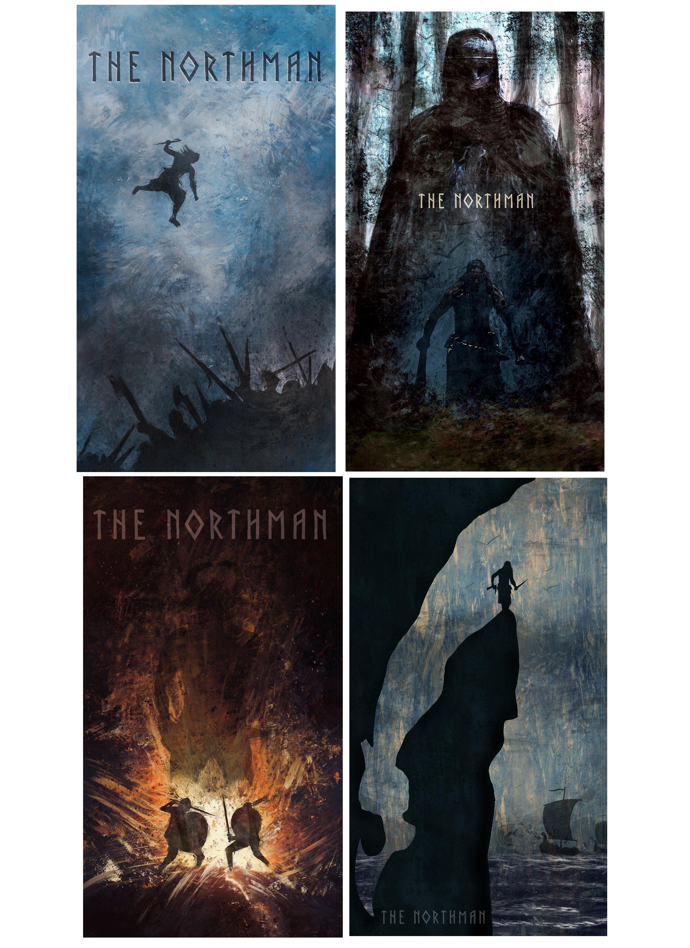
Gotcha! You thought I was talking about Game Of Thrones didn’t you? I was talking about the new movie THE NORTHMAN which was released on Peacock this week.
In short, The Northman is a revenge movie dealing with ancient Viking Lore and culture. It’s grittiness reminded me very much of GOT in that respect. Any how, through Talenthouse I submitted some promotional artwork for the film. This was difficult because, except for the vague movie trailer and some photography stills, I didn’t really know what this movie was about in regards to context.
Sadly, none of the proposals I did were utilized for the marketing of the film. That said, I was very pleased with my results and am happy to share with you.
BUT DO YOU LIKE ME?
Of course you like me. I am awesome. That said, I think about “likes” in Social Media. When I discovered the like button on fb, I just “liked” everything and anything. Good news, bad news, tragic, crazy, it didn’t matter I pressed “like”. Over the years I have tempered that down a bit. My friends seem to have appreciated me doing that. With that, I think about which art works I did received the most likes.
I always am fascinated by which pieces get more likes than others. Maybe it’s timing, algorithm, interest or all the above. Regardless these select pieces (by instagram, artstaion) are works that got the most clicks. I hope you like them.
THE 80’s WERE FUN
I am very excited about Stranger Things Season 4. The series directed by the Duffer brothers has been nothing short of popcorn fun and nostalgia that makes me declare that these kids, in the show, were my best friends back in Junior High School. Fabricating memories that never were is just a really healthy way of doing things. Don’t you? In all seriousness, it is rare that a show like this makes you revisit the past, in a way that makes you feel really good. I can’t wait!
Here is a piece I did of a Demogorgon a while back to impress my niece.
ORPHEUS
Very recently I saw the Broadway musical HADESTOWN. Loved the shit out of it. It made me think about Orpheus (in regards to mythology) and especially, the French film adaptation “Orpheus” from 1950. I feel connected to this film because I had to do a design assignment for this back in Art School (New York City Tech). It was to do an abstract design based off the movie using color film cut outs. The composition was based off the scene in where the hero enters into Hades with strong wind against him during his travels in the underworld.
This assignment for the class was EXPEEEENNSSIIIVVVEEE. Any old school art student/artist back then (which is amazing because I am only 28) will tell you that Color Film was not cheap. Though I did do a rough layout sketch, I was going about this using pure gut, but at the same time wanting to be methodical. At the end, I threw caution in the wind and used up all the fragments of film that made sense. This piece got over very well. From teachers, fellow students and friends, they all loved it.
IT HAS TO BE SINCERE.
A year ago Jack Terricloth of the World Inferno Friendship Society (Cabaret Punk Band out of Brooklyn NY) left us way too soon. The scene he created was something special. It’s where I found my wife, made amazing friends and experienced so much adventure and fun. I will always cherish that time of my life.
Now to this piece. It has a bit of a story. Years back (which is amazing because I am only 36), when The World Inferno was developing their album, “Red Eye Soul”, I like many artists in the scene submitted art work proposals that may be used as the CD cover. It was one of the first straight up digital paintings I ever did. In hindsight, it really was not strong. That said, I submitted it, received a polite thank you from the Jack and that was the and of it. The gorgeous album cover that would be used was designed by amazing artists Rain Polsky and Brian “Brainy” Carter.
After learning of Jack Terricloths passing, I reached out to those who I knew who were closest to him. When I contacted Brainy, he shared with me the sweetest account describing in great detail of how much he (Jack) loved what I submitted. Quite frankly, he was very gitty about it. I was taken back and confused because like I said, I didn’t feel that it was strong. Brainy went on to say “Jack believed that good art had to be sincere.” He would go on to tell me that Jack spent hours going on about different design directions that he wanted to go in but would always come back to my piece saying, it’s just really sincere”.
After hearing that story from Brainy, I went about re-working that image which would be part of several tribute pieces I did that week. It’s been almost a year and even now, I still am processing Jacks passing. That said, I am happy that I did something that generated such emotion. Happy that I was able repay him at some level in what he gave to me and so many other people. I say that sincerely.
BLINDED BY THE LIGHT
Not literally. Not the song but the movie inspired by the life of journalist Sarfraz Manzoor focusing on his love and devotion for the music of Bruce Springsteen. It takes place during the late 80s in Newton, England. I gravitated to this film for several reasons. For starters, my love of Bruce Springsteen. When I discovered his music, like the main character, I was transported and equally as effected. In addition, during that time period, I would do a 4 month stint in England as an exchange student. The experience was quite amazing. The film captured that time period both in tone and style. I felt like I was revisiting old friends.
I talk about this because I just re-watched the movie and was transported to that part of my life again. It felt good. It still feels good. It feels good to share this with you.
ANAVRYTI
Very recently my family had to say goodbye to a wonderful Aunt who lived a long and proud life. She (like my father) was born and raised in the village of Anavryti located in the Taygetos mountains outside of Sparta, Greece. It is a beautiful small village that has so much rich history and character.
I talk about the Anavryti village because I recently started a side project in sketching from (preferably old) photographs of the people who had lived there. Doing things, doing nothing, having fun, working hard and just capturing the life and essence of what being in that village is like. Unlike my WAR sketchbook series, this series is is done digitally. I hope to make a nice little book out of these when I feel like I did enough. I think my Aunt would of liked that.
SUPERMAN DAY
Did I talk about my love for DC Comics? I’m sure that I did. Did I tell you that Superman is my favorite all time super hero? Well I am telling you now. April 18th, 1938 is when Superman made his debut in Action Comics thus making it SUPERMAN DAY! Why I love Superman? What is not to love? The action, the ability to still be a relatable character who inspires to bring out the best of us in any way that it could be. In addition, the character is always opened to evolving which representational of the times that we live in.
I did many works with the character over time and never felt I got it right until in recent years. Here are some of my favorites. Enjoy!
CATS SLEEP AROUND
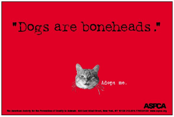
Besides Illustration and Image Editing, I do Graphic Design and Art Direction. That was my main focus when I graduated from Art School. When I entered the job market, boy did I struggle. Combination of bad timing, the speed in how technology was changing, personal growth issues, but mainly, in hindsight, not setting myself up for success. Finally, in my mid to late 20’s (humble pie) I took on an internship position which turned into a full time gig. The company was “Bleecker and Sullivan Advertising”. No, there was no Bleecker or Sullivan, it was the cross street. I loved being there! The people and talent was immense, I learned so much and we had so much fun. Anyhow, one of the 1st big projects I worked on was for the ASPCA. It was a postcard and subway poster campaign for them which was a follow up from an award winning campaign that they did six months earlier (Credit goes to the copy writer named Eric who was ammmaaazziiinggg, but don’t tell him I said that. He has a a very big ego).
The follow up campaign was challenging. The client had specific imagery that they required, and boxed us in to a 2 color job. (Ssiiigghhh, the days of print.) So the design needed to be bold and simple and at the same time, maintain the integrity as the previous series. We collaborated on a Cat vs Dog theme in where in the headline, they insult each other while a call to action states “Adopt Me”. For Cats, it was “Dogs are boneheads”. For dogs it was “Cats are Pussies”. The client loved our ideas. Everyone was excited. However, several days before it was to go to print, they had concerns about “Cats are Pussies” for the obvious reasons. How I remember, the Creative Director, several writers and account reps, were on the phone with the client near two hours pitching them all sort of tag lines that no one was happy with. Thhheeeenn. I walked into the office, understanding what was happening I scream out “Cats Sleep Around”. With roaring laughter and applause the line was approved on the spot.
DIGITAL INK AND GREEK MYTHOLOGY
Back in the day which is unbelievable because I am only 41, I enjoyed composing stippled ink styled illustrations. The upside to that style is that you can get amazing results that are rich, abstract and engaging. The downside, an incredibly long and slow process. Even worse, if you made a mistake or something that you thought was working now doesn’t (sometimes we see what we want to see), then all that time that you put in is gone. However, with the Procreate app, there is a function tool that simulates that style and it is both fantastic and super fast. The projects that one engages in can still be lengthy (depending on what yo are doing), however, it is not nearly as daunting.
Below are some illustrations that I first did using the procreate app (stippling tool). They are based off of ancient Greek mythology characters of Prometheus, The Cyclops and Medusa. (Right to left). Anyhow, these pieces were pretty successful, particularly the one of Prometheus. That would go on to be featured in several blogs/sites focused on Human Rights and Artistic Freedom. However, my favorite out of these was Medusa. Very classical, Mediterranean yet creepy.
Will be posting more of these (past, present and future) in coming blogs.
THE GOAT!
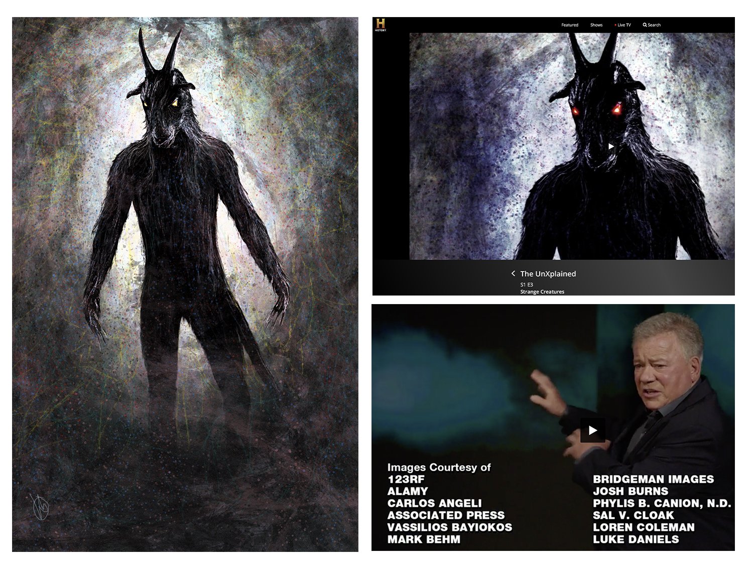
Not greatest of all time, but definitely great. Great as in getting my work featured on The History Channel show “The Un-xplained” starring the main man himself, William Shatner. Fan boy mode in full effect for me.
The piece is called GOAT DE-MHAN. A digital illustration portraying a half man and half goat demonic creature. It was shown in episode 3 that discussed “Strange Creatures”. Irony? I did this as a pitch for another assignment and it was flatly rejected. However, I posted it on Artstation.com (forum for digital illustrators), and immediately I was contacted by a producer who wanted that image in that chapter. This would lead to some more commissions for later episodes.
DEATH AND TAXES
Just did my taxes. Was violated again. Fortunately, we have a great accountant that minimized the damage. This time of year, the Ben Franklin quote of Death and Taxes comes to mind. When I think about Taxes, I think about money, When I think about Death, the room goes dark, I hear a gong, then I hear the theme music of the Undertaker being played.
Yes, The Undertaker. The Phenom, The Deadman, the American Badass one of the greatest professional wrestlers that has ever entered the ring. The size, the grace, the raw power, and his ability to strike fear with his deliberate performances. I bring him up because this year, he will be inducted to the WWE Hall Of Fame. It is well deserved and I celebrate his accomplishments in that profession.
Below are some works that I did of him. Thought it wold be appropriate to share.
WORLD WAR ME
Many years ago, which is unbelievable because I’m only 37, I embarked on a series of traditional pen and brush ink drawings based on War themed photography mainly focused on World War 2 and Vietnam. The reason I did this was… well… I forgot how to draw. Sounds crazy? Actually not at all.
During that time in my life I was graduating from college and focused on so many things. I was an Art Direction major (mainly graphic design focused in advertising). In short, I was so preoccupied on that aspect of my work and the pressure of graduating, building a portfolio, trying to find gainful employment in an already changing world in where my work was already obsolete (that is a story for another time). So much so, that I let the basics go. I stopped sketching and and practicing the fundamentals of what made me… well… me!..lol
Once I realized that my drawing skills fell into atrophy, I decided to do what my art heroes did (George Pratt and Ralph Mcquarrie). Doing a series with pen and ink drawings focused on military imagery. I did that, and the results were wonderful. This practice loosened me up again, confidence in how I approach projects and the over ability to convey on paper on what I wanted to communicate.
In addition, I was able to gain a perspective in warfare that I never would have had. Many former serviceman and vets who saw this appreciated it and loved what I did. That type of kudos is what I found most meaningful.
Below are some of of the sketches that I did. There are sooo many more and will soon re-upload them onto my website again once I find a way to present it that makes sense.
ANDRE THE GIANT
I love professional wrestling. It is the greatest male soap opera ever. I love the stories, the pageantry and the athleticism. One particular wrestler (actually many) that I enjoyed watching was Andre the Giant. 7 ft 6 inches near 500 lbs. Such a carnival attraction and larger than life character. How he interacted with the crowd, applied his gentleness so small children could be entertained and knew when to unleash as the monster hero who defeats the villain.
With the procreate app, I did a nice sketch series called “SEVEN DAYS OF ANDRE THE GIANT”. Doing one sketch per day and posting it on Instagram. Capturing the grittiness of the matches of that time, the emotion, and the drama, made for a nice little successful series. I plan on doing more of these with other professional wrestlers of that era. The raw quality comes through as a fantastic engagement with the viewer.
Below are the sketches of the eeeiigggtthhh wwoonnddeeerr of the woooorrrllld…ssiiiggghhh.. sounds such better when a ring announcer says it.
MORBIUS AND JORDAN CATALANO!
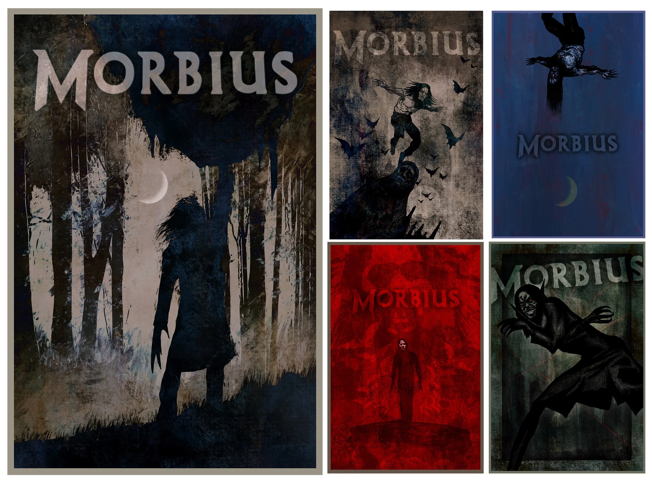
Quite recently, I was asked to submit concept art to be used by SONY Entertainment to promote for the upcoming “MORBIUS” movie starring Jared Leto. Though I am a true DC comics fan with a certain loathing for Marvel characters (I am bias so sue me!), I really sunk my teeth into this assignment. In addition, I have always adored Jared Leto even as far as his days as Jordan Catalano in “My So Called Life”. Siggghh.. He is so dreamy!..lol
In executing this task, I meditated on several ideas and directions. From Nosferatu influences, playing with duality, contrast of intersections and good old fashion compositions. I threw the kitchen sink at this project and I was excited by most of my results.
Below, are the submissions that I was most proud of. In particular, the largest piece (Morbius lifting a boulder), was by far the most successful. For that, I played on contrast of elegance while projecting savage strength. That piece actually made it to Jared Letos eyes (so I was told). It was featured across all of SONYS Entertainments Social Networking platforms (FB, Instagram, Tiktok, Twitter), that also including Marvel Entertainment, Morbius Movie, their European counterparts, etc. In addition, it was picked up by various fan sites and movie blogs. With instagram alone, the image generated 20,000 plus likes coupled with so much positive feedback. That was great for the ego. That being my ego.
What made this experience so fantastic was the overall quality of submissions from other artists. They were nothing short of amazing. I was rather intimidated by that level of talent, yet being able to hang with the industries best and still be a stand out to was quite thrilling. In addition, receiving their personal kudos was both humbling and gracious.
I want more projects like this.
PROCREATE & ME
Procreate is a digital drawing tool that is mainly used with the IPAD. I first discovered it back in 2012. Wanting to cross over to using digital and struggling/becoming frustrated with my analog work, this program app has been such a deep creative explosion for me, especially once the Apple Pencil came out. I felt like I can do what is in my head with so very little getting in the way, while at the same time, able to create opportunities in where happy accidents can occur. My personal Facebook page very recently showed my digital paint sketches that I did 10 years ago. It is a great reminder in how far I have come with this product. Below are some of the earliest works using this tool. Trite but true, hard work does pay off!
CAN WE TALK?
Sure… Let us talk about negotiations. An accidental theme that I am slowly developing as a fun little series. To backtrack, growing up, I became a fanatic fan of playing dungeons and dragons which cemented my love for fantasy themed art work and artists such as Frazzetta and Boris. What I enjoy so much in this genre is the play of contrast in scale. Smaller beings challenging much larger and fantastical creatures. That visualization almost always brings a smile to my face. Such a trick adds drama, tension and often comedy to the story.
With this series (which is slow moving and sporadic), I did just that.
THE BEGINNING OF THE END
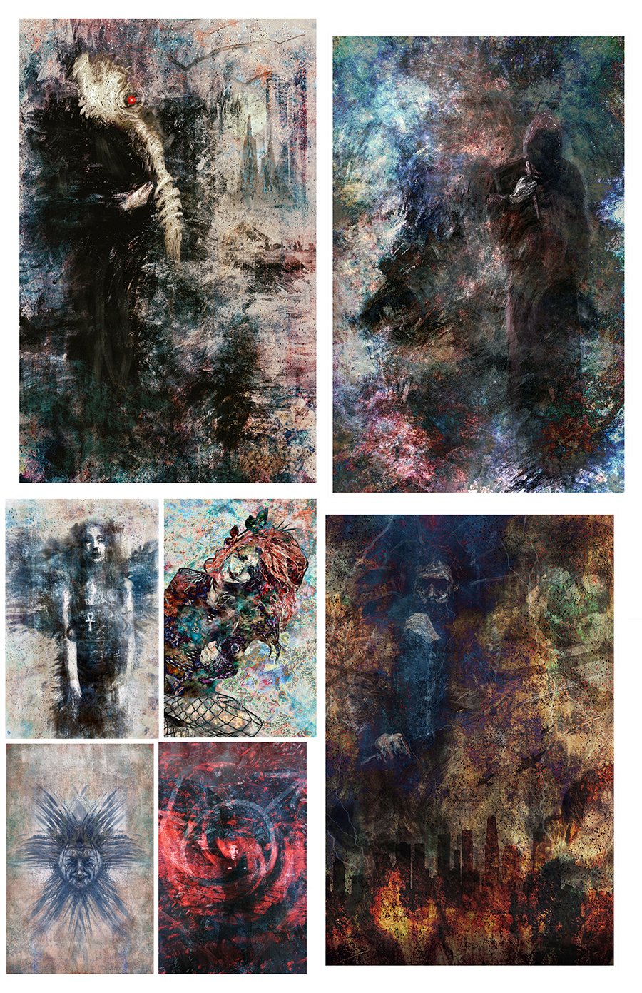
Or beginning of the Endless! Many years ago (which is unbelievable because I am only 29), while in Art School, DC Comics published a new line of books under the banner called Vertigo. These would be titles that are focused on the more sophisticated avant-garde adults who enjoy comics. In short, ART STUDENTS!!!
As an open minded reader, I was excited about what Vertigo comics would bring for I was already loving Doom Patrol and Animal Man. However, Sandman would become the flagship title that would elevate Vertigo beyond DC Comics expectations. As I was attempting to get into Sandman (didn’t have the wallet to stay current on everything), I was noticing to what I felt was a bit of a nasty trend. Many of of the hardcore Sandman readers were some of the biggest elitist snobs that I ever met. I recall one person saying to me “I don’t read comics, I read Vertigo.” After hearing that, I was turned off by that series (and its spin-off titles) and never bothered with it again until years later.
Fifteen plus years passed (again it’s unbelievable because I am only 31), I would finally break down and give the series a chance. Overall, I was pleased which made me angry. Angry that I would allow a group of people who have no bearing in my life to not letting me enjoy something special like this. To that I say never again!
Now, to these pieces. This is a stream of digital paintings done using Procreate app based on the characters of The Endless (Sandman, Death Destiny etc). I have done works with some of these characters before but this series is my love letter to them so to speak. How they have become eternal, ever lasting and remaining true at its core. Endless? Nah.. I say it’s still the beginning!

